
a smart tool for your closet and the environment
In 2023, I completed a UI/UX Certificate program at the University of Washington. We were tasked with addressing a societal problem through building a novel application. Ensemble focuses on reducing textile waste while empowering users to dress and feel their best.
role: ux researcher + designer
year: 2023
duration: 9 months
tools used: figma, adobe illustrator, adobe photoshop, balsamiq
THE PROBLEM
our fashion trend cycle promotes over consumption + lack of empathy for the earth.
cpljadndajlpc“how can we create a more mindful fashion community that deviates from the current waste cycle?”
21 users interviewed
personas developed:
the thrifty fashionista


values trends & social media
wants easy shopping experience
the cheaper, the better
buys to stay current
interest in fashion
4 competitor apps analyzed
values comfort
interest in sustainable options
invests in quality
buys to fill gaps in closet
indifferent to fashion
the curious spender
10 journal studies reviewed
social media has drastically changed the way humans think and value their clothes
for every five new garments produced each year, three are disposed of
on average, americans buy a new piece of clothing every five days
things need to be cheap and fast!
fosters unethical production practices for workers


cpljadndajlpc
awful for our planet
THE SOLUTION
ensemble is a tool that provides a space for people not to feel pressured by what they don’t have, and instead foster creativity with what they already own
anathrough three main goals:
seamlessly create a digital twin of their wardrobe
foster a mindful and supportive fashion community
re-inspire their closet using AI
cpljadndajlpcdesign process
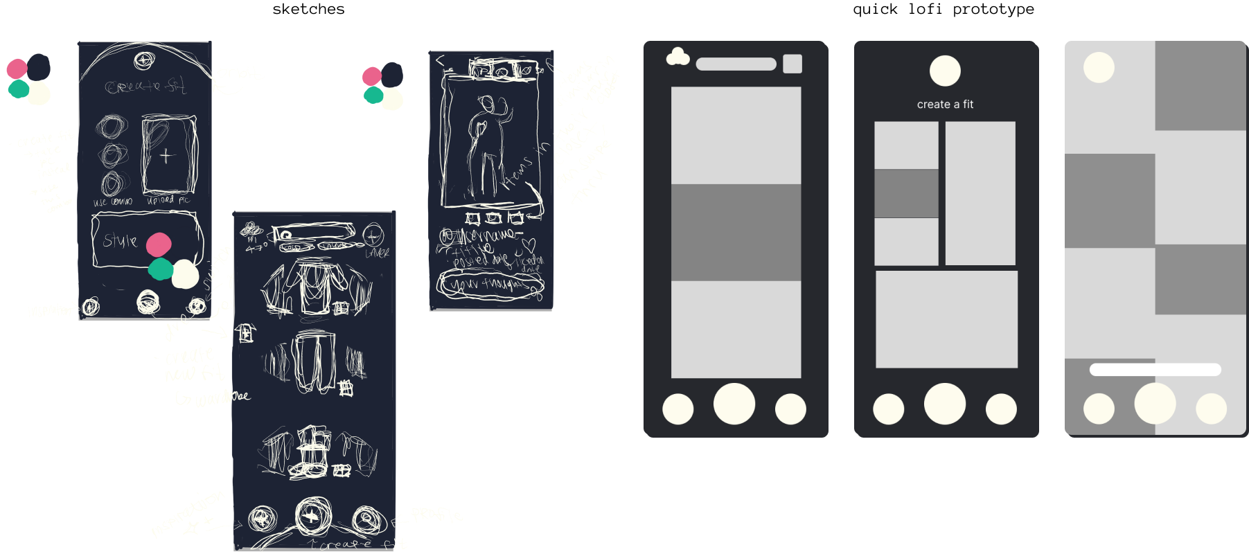
INFORMATION ARCHITECTURE + SKETCHES
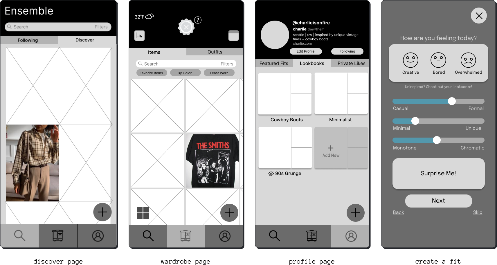
site map

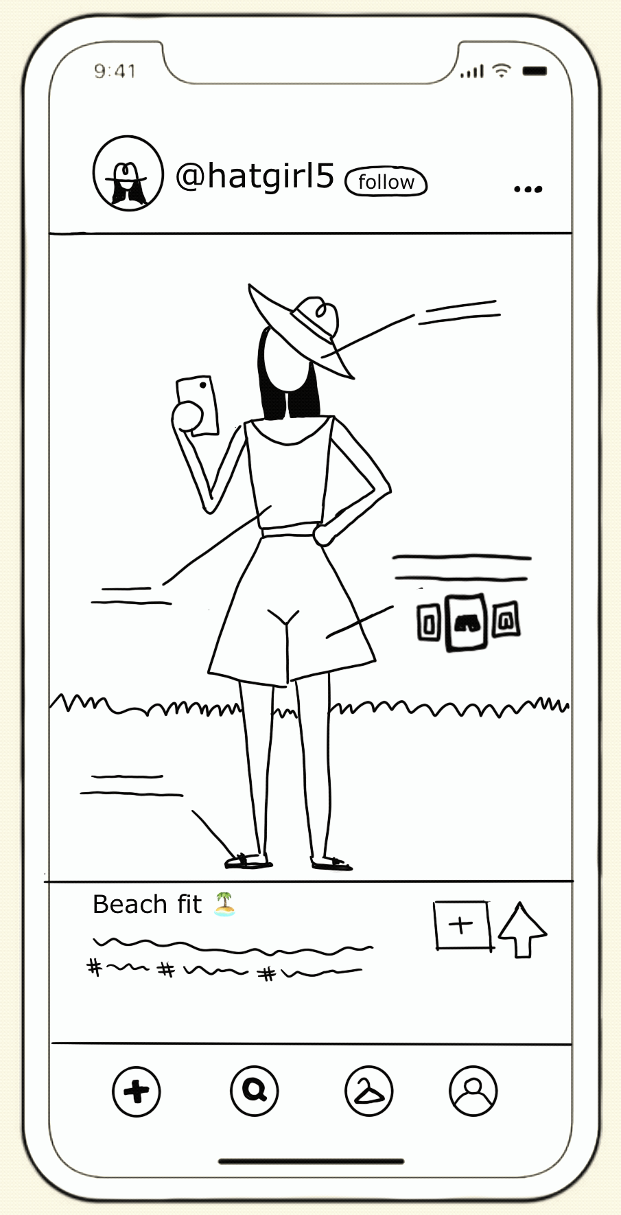
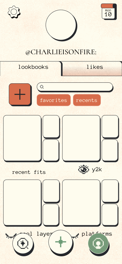
Since the user’s wardrobe is the most important aspect, it should be the central page of navigation. Next is the Ai Styling Tool, though I felt like this needed to be seen on every page since it was the specialty service, integral to the app. Finally, I added the user’s profile and discover pages.
As a previous animation and illustration student, figuring out color, logo, and final layout design process was the most fulfilling.

SECOND PROTOTYPE
Informed by the user testing feedback, I iteratively refined the concept through rapid prototyping. This process involved creating detailed sketches and wireframes for a second prototype, which served as a crucial intermediate step before proceeding to the final design phase. This methodical approach ensured that user insights were thoroughly incorporated, enhancing the overall usability and effectiveness of the final product.
COLOR PALETTE + LOGO DESIGN
When it came to color, I kept the main purpose of the app in the back of my mind: sustainability for the earth. Therefore, I thought that earth-toned colors would fit the app the best. Green needed to be a staple color.
From looking at my competative analysis notes, I wanted to create something different from what others have already created. Since I was already thinking of an earth-toned theme, what could I do that was different?
ASSETS
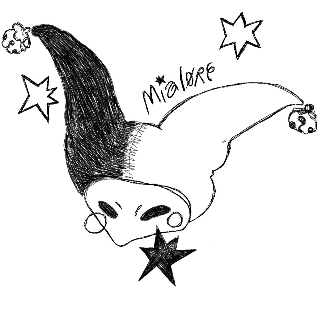
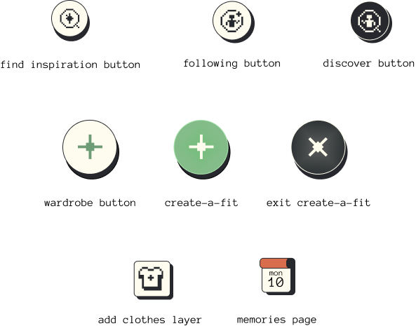
I created a custom display font and icons that felt well suited for the app, something that felt completely digital while also nostalgic. Sharing my own artistic ability with this project was really enjoyable - I had a lot of fun coming up with these designs!


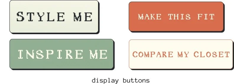
As for buttons, I kept with the orange and green theme, making the important buttons stand out. However, I would still like to do some user testing to see how appealing these are, or if I should simplify further and make a monochromatic palette.

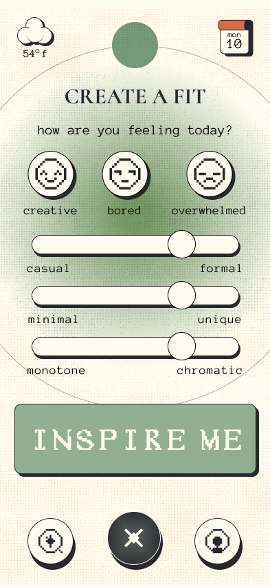
With environmental conservation at its core, I refined the color palette to reflect the app's natural essence. To differentiate from typical eco-designs, I incorporated unexpected elements inspired by 1990s aesthetics, particularly the film 'Clueless'. I really loved the thick pixelated text and big buttons the computer had when Cher was creating an outfit (see “mis-match” picture).
After user testing the first prototype of ensemble, I received feedback on how the app felt, which included:
Refined button text for clarity and user engagement
Streamlined icon designs for improved visual coherence
Optimized navigation bar for a sleeker interface
Enhanced user flows for more intuitive interactions
Injected playful elements to increase overall appeal and user enjoyment
MOODBOARDS
FIRST PROTOTYPE
To start the architecture of the app, I created many different site maps to brainstorm which layout would make the most sense and be the most intuitive way for people to navigate around. I did a quick 1 minute - sketch exercise of different layouts for each page to help boost my understanding of app construction.

Drawing from the two moodboards I created, I decided to blend the retro-feel with the natural elements, and so the final design was born.
The word “syzygy” was also an inspirational expression that came to mind. With it’s meaning relating to alignment, I added this motif in the logo design.
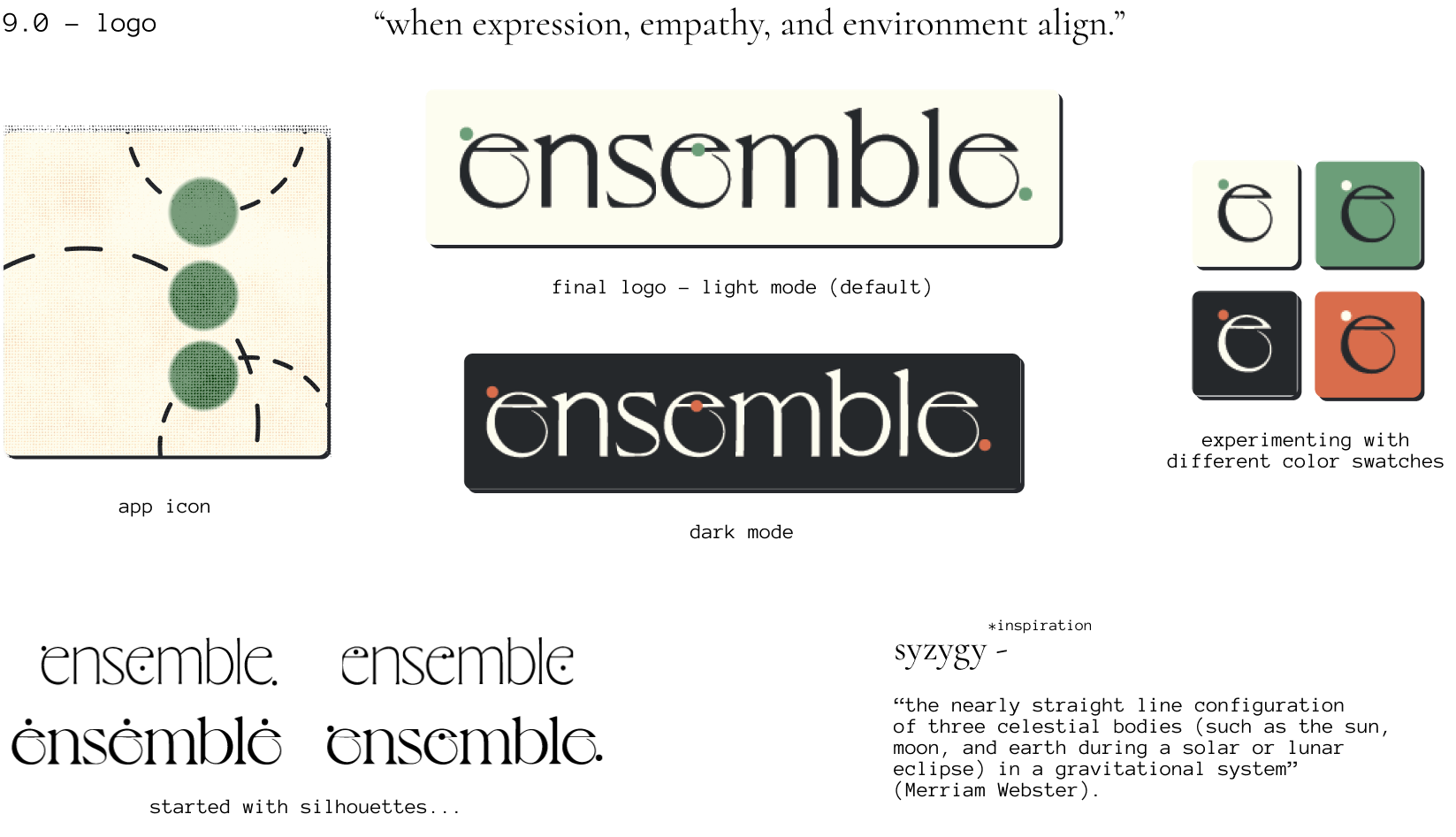
For the text display, I used the typefaces Anonymous Pro with Cormorant. I chose these because Anonymous Pro fit the retro style of the app, while Cormorant smooths it out with its elegant and sharp lines.
FINAL THOUGHTS
Future Enhancements and Aspirations:
Conduct comprehensive user testing to refine the final design
Implement advanced features:
Integrate animated elements
Develop an AR visualizer for virtual try-ons
Establish connections with local vintage boutiques
Engineer the AI component for the styling suggestion function
Design and develop additional key pages:
'Wardrobe Stats' for user analytics
'Memories' for a personalized user experience

Overall, this was an amazing experience for me. This project strengthened my design thinking, stretched another part of my creative brain, and helped me to understand the nuances of building an app. User testing, interviews, and research were another aspect of the project that I enjoyed, since the people side of design so heavily interests me.

initial sketches of flow done in procreate
To explore diverse creative directions, I developed two distinct mood boards. The first featured an earth-toned palette aligned with the app's environmental focus, while the second embraced a retro-inspired aesthetic. I decided to take elements from both boards.