Pipe & Row Web Rebrand
A local Seattle boutique reached out to me to help reinvent their website to eliminate ux/ui issues, increase user efficiency and re-establish their brand aesthetic.
role: ux researcher & ui designer
year: 2024
duration: 1 week
tools used: figma

01. identifying the painpoints
Key issues across the site included:
Inefficient user flow
Confusing menu structure
Inconsistent brand experience
Presence of dead links and outdated inventory
Suboptimal information architecture
Insufficient focus on product imagery
Thorough research on leading fashion e-commerce sites was conducted, analyzing their navigation structures, product presentation, and checkout processes. This informed my design decisions and ensured the new site would meet industry standards.


02. efficient user flows & structure planning
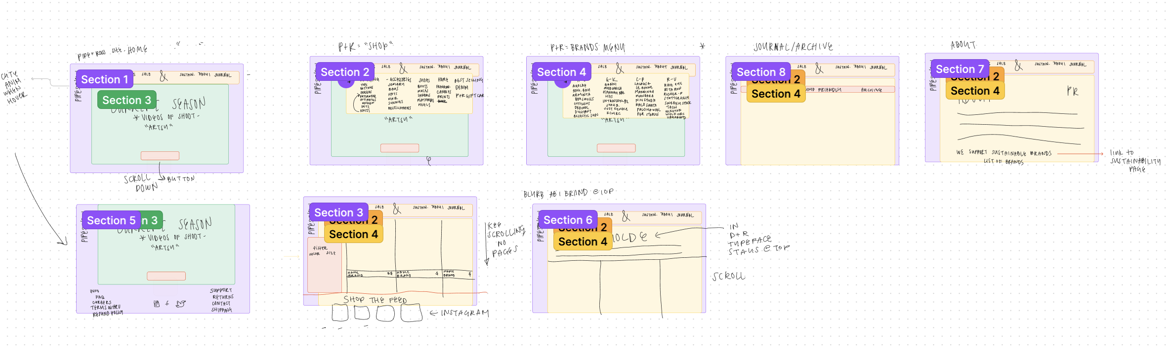
I developed a comprehensive diagram to streamline site navigation and content organization, addressing the identified pain points.
Using Figma, I created an intuitive flow chart to optimize the customer journey, with a focus on simplifying navigation and prioritizing the shopping experience.
consumer update sign up
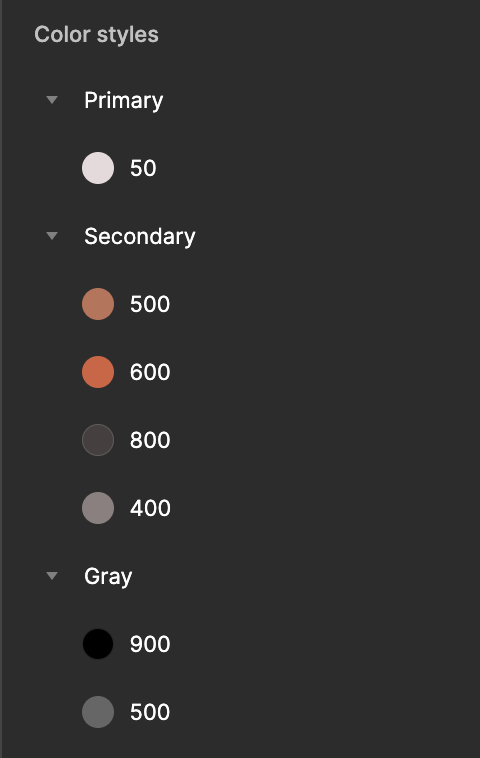
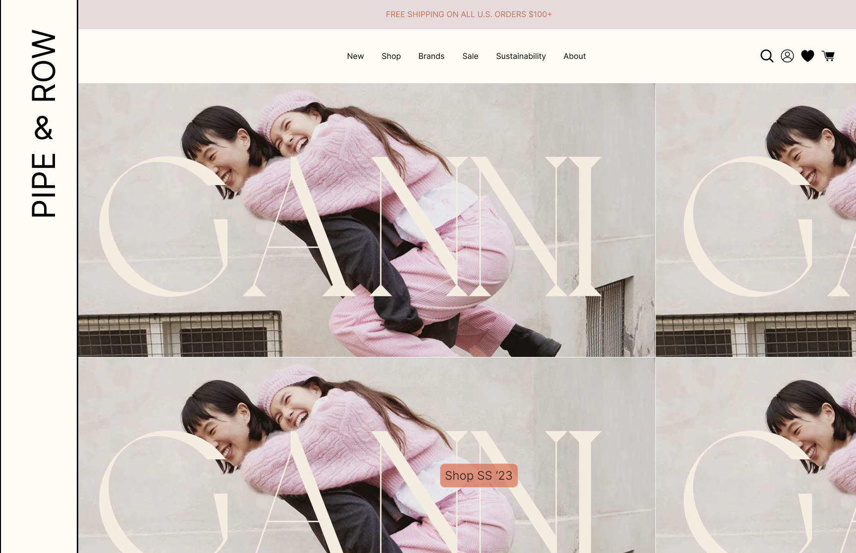
main color palette (v. 2023)
03. visual design elements
While maintaining the original site's color palette and aesthetic essence, I modernized the design to improve accessibility and align with current web trends. I integrated elements that performed well on competitor sites, adapting them to fit P+R's unique brand identity.
The main pain points I focused on was the navigation bar. As you can see, there is too much information in such a small space. The typeface is monotonous, and therefore challenging to access what you are looking for.
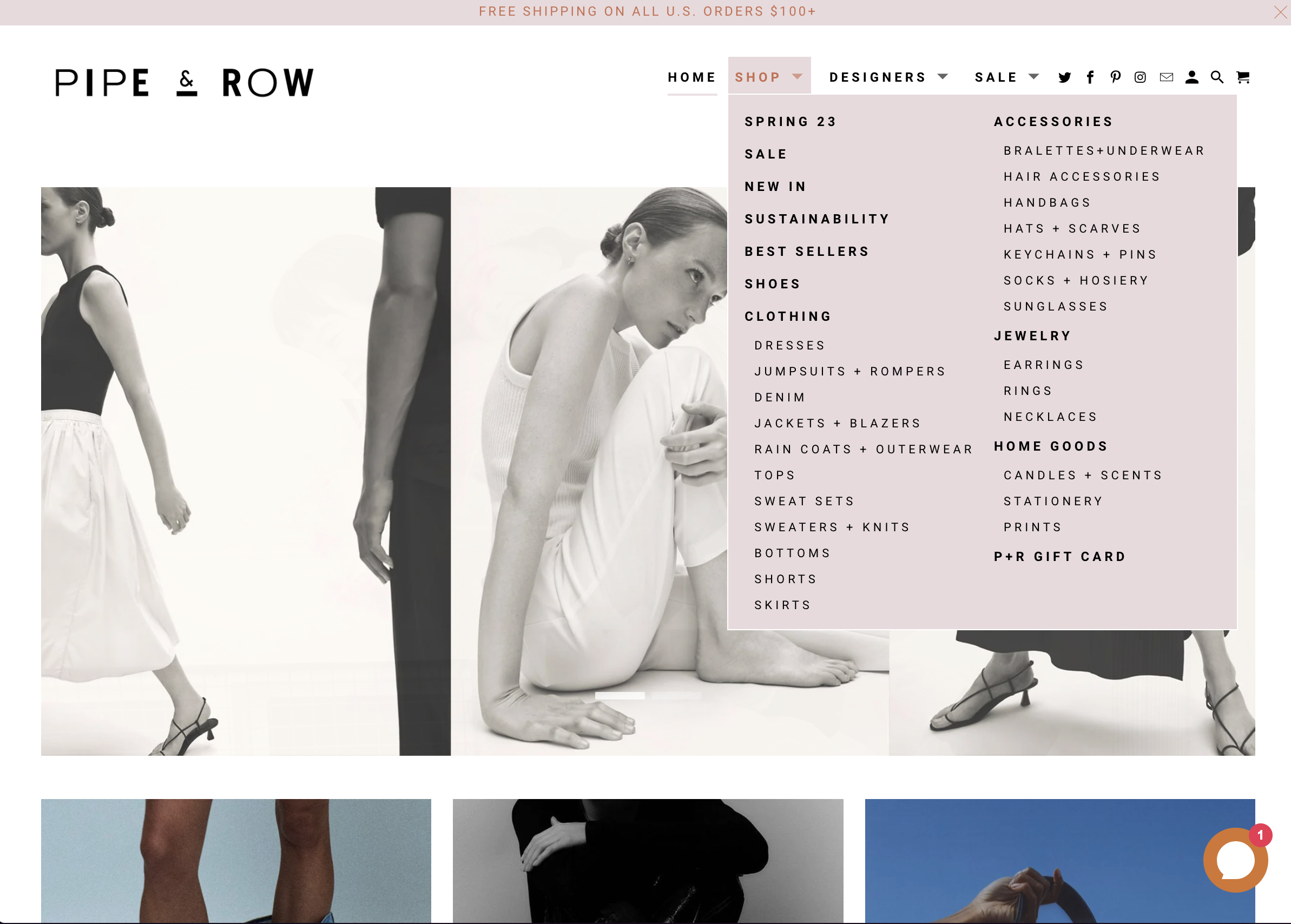
Since there was too much information on one navigation menu, I decided to split it into two categories:
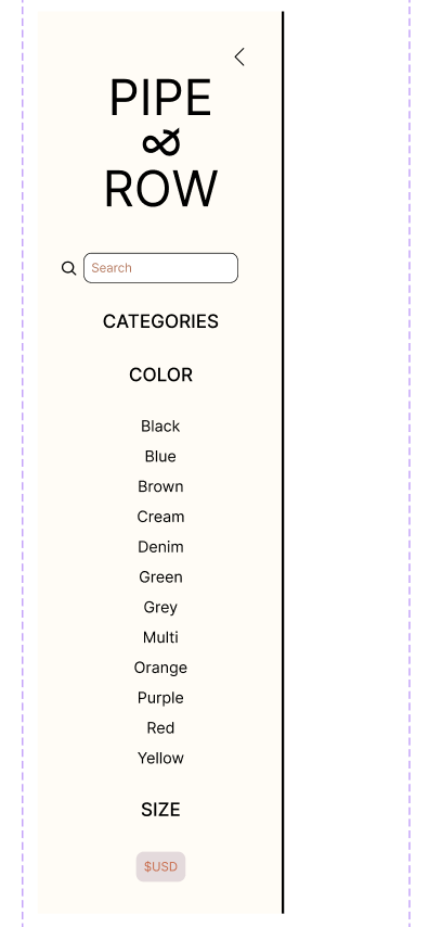
redesigned side navigation bar components


redesigned main navigation bar
Not only is this more organized and less chaotic, it also streamlines user access to to what they are looking for. Adding filters also helps in clarifying buyer needs.
Side navigation bar: Used when the consumer is looking for a particular item’s size, color, or category (side)
Main navigation bar: For home, casual shopping, looking for a particular brand, sale, or wanting to know more about the company (below)

page selection color change
04. the final product
Key improvements included:
A more polished UI with consistent styling throughout
Creation of a universal "P+R" brand experience across all pages
Removal of dead links and outdated inventory items
Reorganization of information in a more logical, user-friendly manner
Emphasis on product photography to enhance the shopping experience

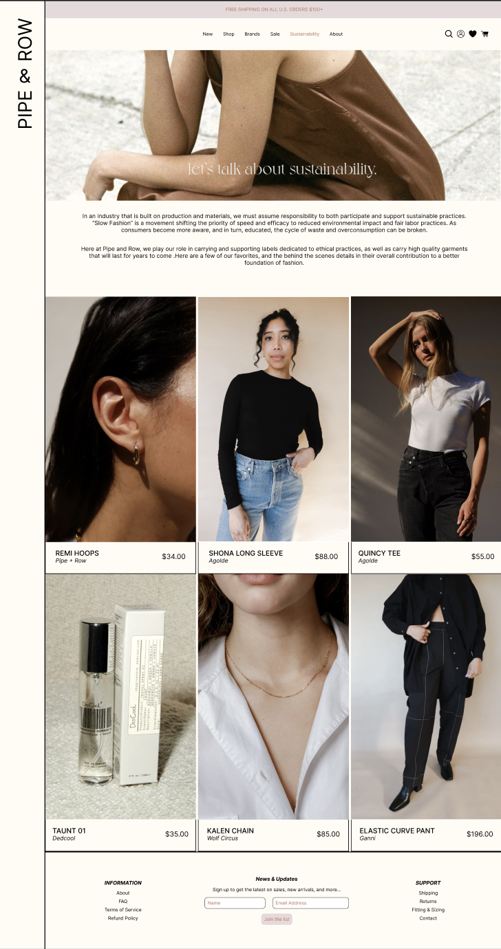

Brand and Sustainability Pages
Project Conclusion & Takeaways
Design decisions, explained:
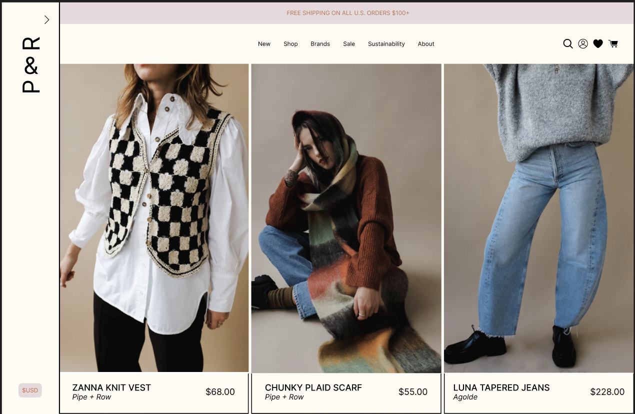
Home shopping page
Visually, I centralized the products more on the page, which also helped when condensing the side navigation page.
I made the images bigger for better visual interest.
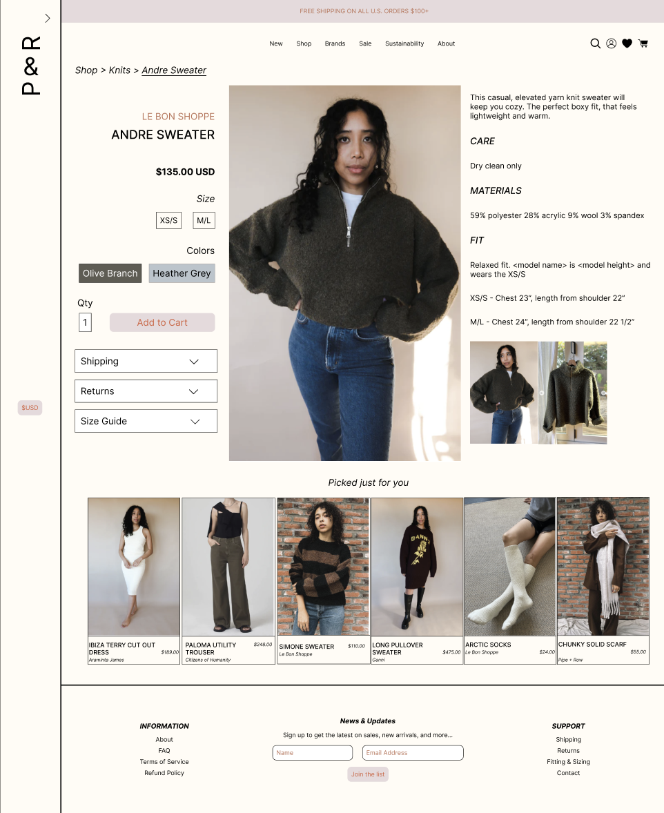
Product Page
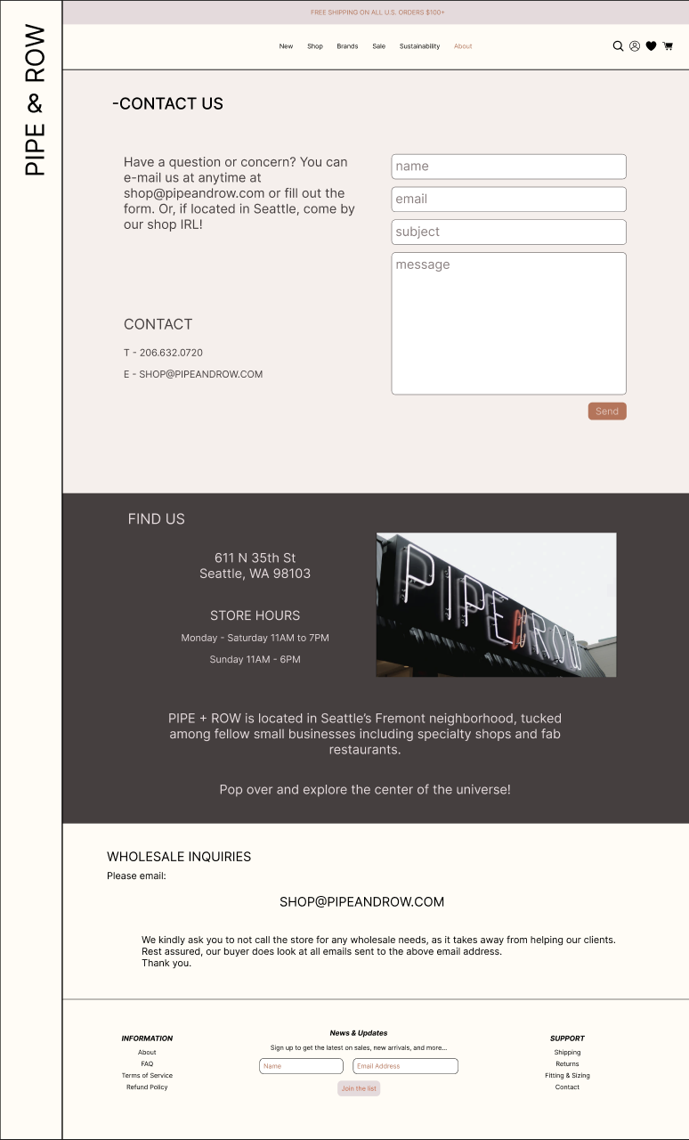
Contact & About

I made a main navigation link to the about page, since people like to know who they are supporting in business. Contact will still be located in the footer. Separating these two pages created better organization, keeping user needs in mind. By doing so, users are assured that “Contact” can be a place to reach out to customer service, while “About” is used for more information.

Garment is at the focus of the user’s webpage.
Identified and made the different color option more user-friendly.
Suggested items are also shown, to maximize sales.
current “about” page

Through careful analysis and implementation of UX design principles, this personal project for Pipe & Row has transformed their digital storefront into a more intuitive and accessible website for their customers.
The redesign focused on enhancing the visual hierarchy and user flow through several key changes:
Streamlined navigation structure to highlight key shopping categories
Redesigned product pages with consistent layout and improved image galleries
Implemented a more prominent and intuitive shopping cart system
Created a cohesive color scheme that aligns with the boutique's brand identity
Optimized mobile responsiveness for better shopping experience across devices
This redesign project served as an excellent learning opportunity in applying UX principles to a real-world business case. While the initial implementation focused on visual design and information architecture, the foundation has been laid for future improvements based on user feedback and testing. The experience gained in Figma proficiency and understanding the importance of user testing will be invaluable for future projects.