Karmakology
Karmakology, a woman-owned medicinal mushroom brand based in Seattle, partnered with me to develop their complete visual identity from the ground up. The project encompassed creating their core brand identity, product packaging design, and social media content strategy. Drawing inspiration from both mystical and natural elements, I crafted a cohesive visual language that balanced spiritual symbolism with organic forms. The resulting design system successfully unified their brand presence across packaging, digital platforms, and promotional materials, helping establish Karmakology's unique position in the wellness market.
role: designer & illustrator
year: 2022
duration: 3 months
tools used: illustrator, photoshop, procreate


01. logo
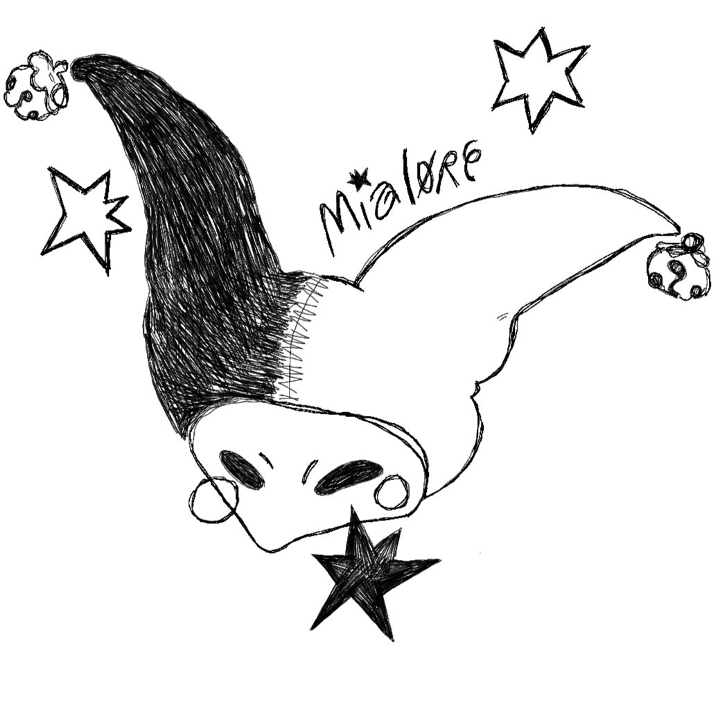
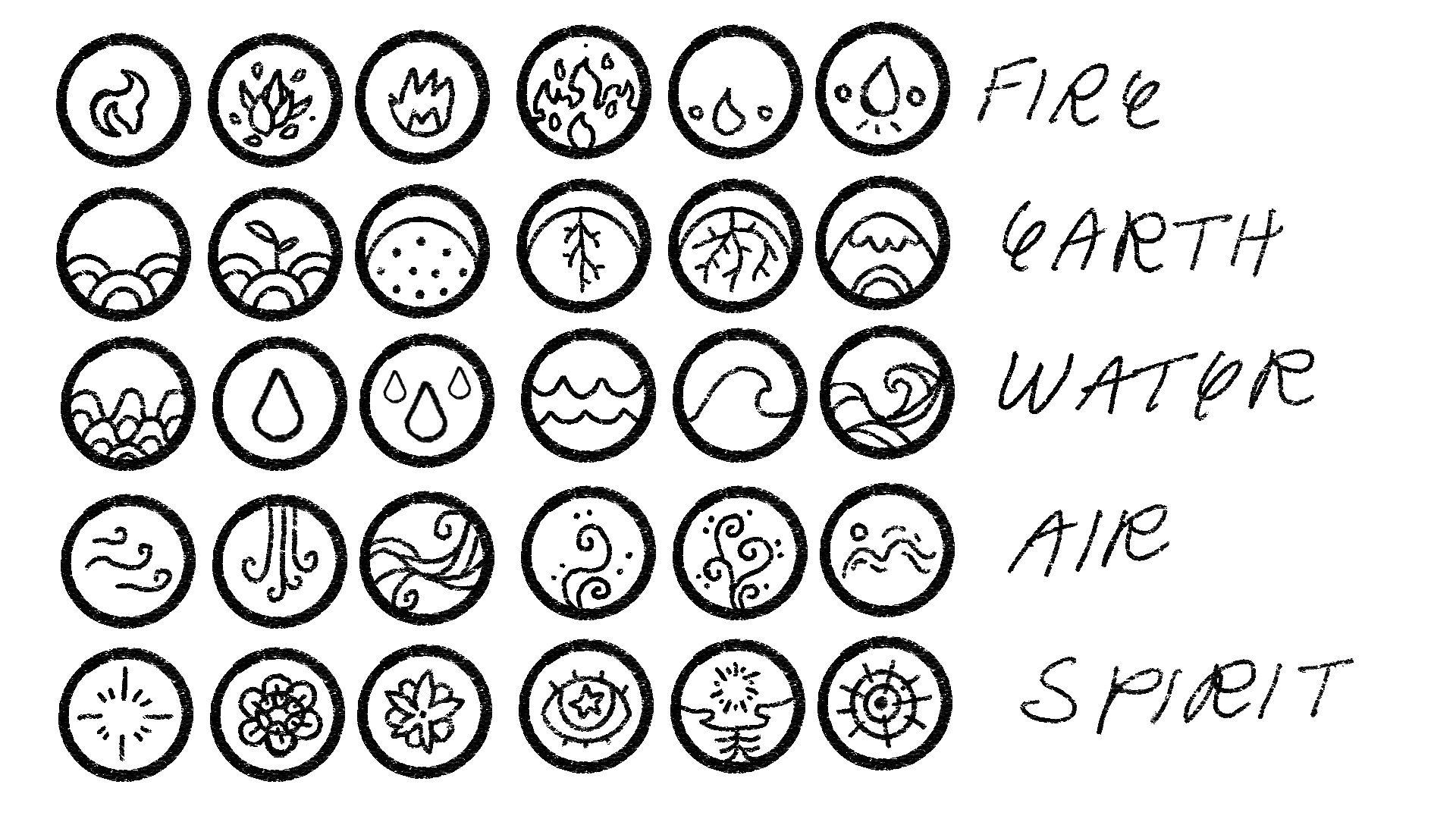
The design process began with numerous sketches, incorporating basic shapes as requested by the client. They wanted it to be a fine line, sketched feel that mimicked the letter “K” while also being grounded. Icons for instagram stories were also created, all referencing the elements.
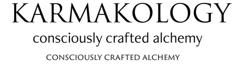
The typography was kept simple, an elegant serif that reminds me of alchemy books paired with a child-like sans serif.
initial explorations
finalized logo


final typography
02. poster design
Karmakology’s poster design drew inspiration from the client's instagram page. Using Illustrator, I transformed their page into a moon-centric design, highlighting the purpose of Yin Yoga, seamlessly integrating carefully selected typography.
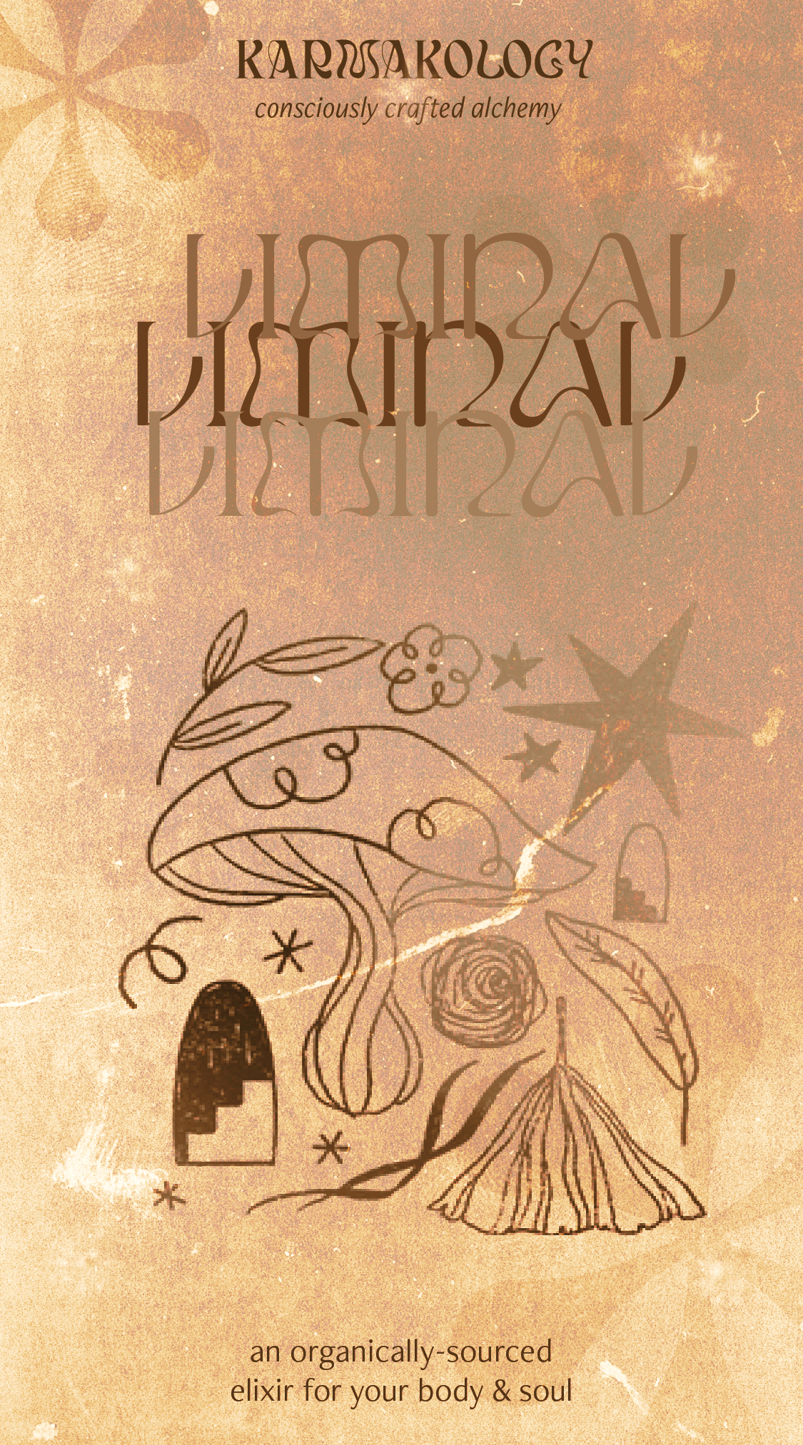
03. product label
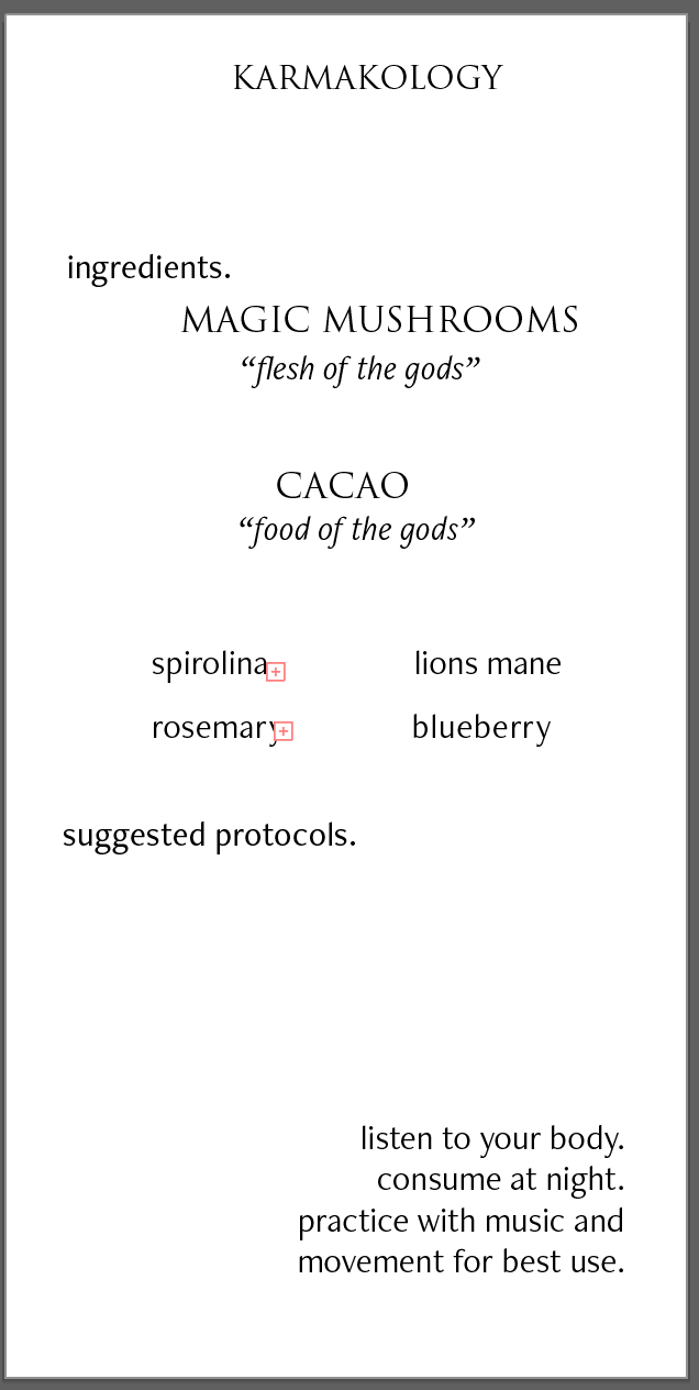
Working from the client's initial layout, I developed various options that blended custom illustrations with typography that echoed the mushroom aesthetic. Each label included a blank line for dosage information, to future-proof its own utility. The final designs were created in Illustrator, balancing brand identity with product information.

01. INITIAL LAYOUT
Figuring out the visual hierarchy and composition of what information needed to be included.
02. FIRST ITERATIONS
After finalizing the base layout, various design assets using Illustrator, Photoshop, and Procreate were created.
An emphasis on mindful ingredients and the sacredness of this medicine was considered, which was highlighted in the illustrations.
Three different color combinations were presented to the client.

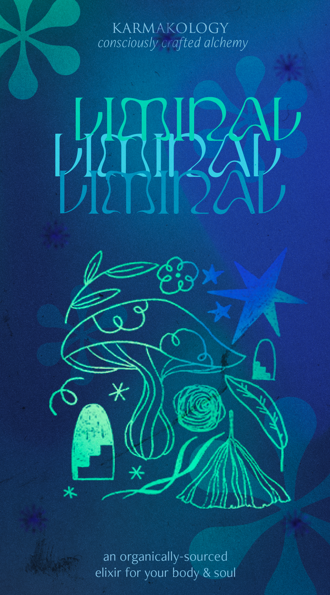
04. final design package

Incorporating the needed changes, I considered the meaning of “liminal” and how it relates to the product—- and the transformative experience offered by these medicinal supplements. From there, I drew out a new graphic that connected to the label.
The client gave three main points of feedback:
Simplifying the graphics
Smoothing out textures
Recoloring with a focus on cooler tones